Forming…
Impressax.
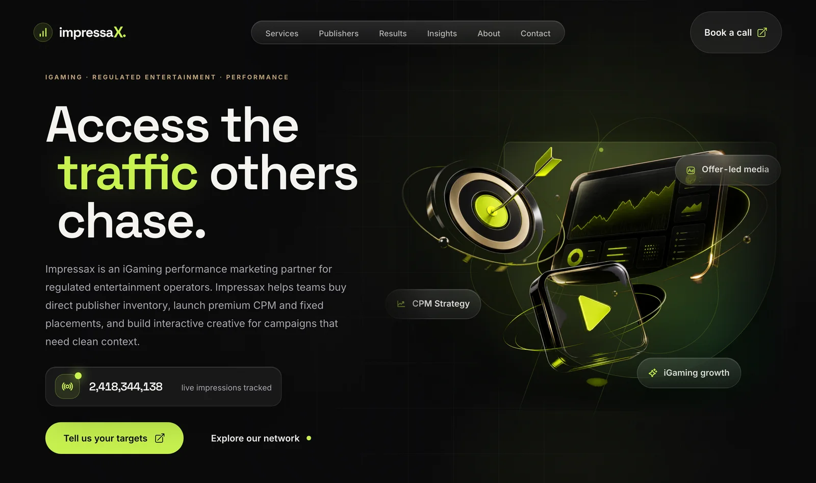
The brand and marketing site for a company that sells regulated operators direct access to premium publisher inventory — no resale layers in between. The work makes “we own the relationship” legible, and makes it feel as premium as the promise.
- Marketing website
- iGaming / ad-tech
- 2026
- Live
- Art direction / UX & UI design / Copy direction / Development
Overview
Impressax is a performance-marketing platform that sells regulated entertainment operators direct access to premium publisher inventory — CPM placements, fixed banners, influencer sponsorships, interactive creative, and its own ad-tech.
The studio’s work is the brand and the marketing site that make that positioning land: access, discretion, and technical credibility, in one confident presence.
Live at impressax.com.
The situation
In this category, inventory usually reaches operators through murky resale chains — brand safety and audience signal degrade at every hop.
Impressax’s entire pitch is the opposite: direct relationships, premium context, measurable intent. The site had to feel as premium and discreet as that promise, to a sophisticated buyer who has seen every generic ad-network pitch.
The challenge
Sell “we own the relationship” without saying it a dozen times. Communicate access, discretion, and real technical capability to a B2B audience, in a regulated space where tone is everything.
The site needed to read as restrained and expensive — the opposite of a loud performance-marketing landing page.
What we did
A restrained, premium art direction: neutral tones, glossy 3D emblems standing in for each capability, and copy that leads with access — “the traffic others chase.”
Each offer — display inventory, influencer and sponsorship activations, in-house interactive units, proprietary ad-tech — gets a clear, unhurried section instead of a wall of features.
Experience & interface
An editorial, dark-to-light rhythm with glimpses of the platform’s dashboards that signal the technology behind the offer without drowning the message.
Motion is minimal and deliberate — the kind of restraint that reads as confidence rather than decoration.
Design system
A neutral, premium palette with a 3D asset language that gives each service a tangible mark. Typography stays dense but calm; the accent is rationed.
The system is built so new capabilities and publisher relationships slot in without redesigning the page.
Display / 36
Heading / 18
Body / 14 — reading text tuned for dense product surfaces, with tabular numerals where money or time appears.
12,480.00 → 08:45
ScheduledIn motionNeeds decisionComplete
One accent, rationed. Status never reads by color alone — icon, label, and weight repeat the message for everyone.
Technical shape
A statically generated marketing site tuned for performance, with a content model behind the service and publisher sections and an asset pipeline for the 3D emblems.
It’s fast, maintainable, and structured so the marketing team can extend it without a developer for routine changes.
Browser
Server-rendered UI
Application
Static generation
API layer
Typed, role-scoped
Systems
3D asset pipeline · Content model · Performance tuning
Where it stands
Impressax is live — a B2B presence that reads as premium as the inventory it sells, and communicates a genuinely differentiated model without over-explaining it.
Proof that a marketing site can carry a serious positioning with restraint instead of volume.
